


1. Why do we need a flexbox?
For a long time, the only reliable browser-compatible tools available for creating CSS layouts were features like floats and positioning.
but in some ways, they're also limiting and time taking. With the help of flexbox, we will achieve many features like
(a) Vertically centering a child of content inside its parent.
(b) Making all the children of a container take up an equal amount of allocated parameters like width and height, regardless of how much width/height is available with a parent.
2. Display: flex-
We will apply and set a special value of display on the parent element of the elements on which we want to apply flex.
Syntax-
.container{
            display: flex;
            justify-content:center;
        }
3. Flex-direction-
This establishes the main axis(axis running in the direction of the flex items), thus defining the direction, flex items are placed in the flex container.
(i)row(default)-right to left in rtl.
(ii)row-reverse-left to right in rtl.
(iii)column-top to bottom.
(iv)column-reverse-bottom to top.
Syntax-
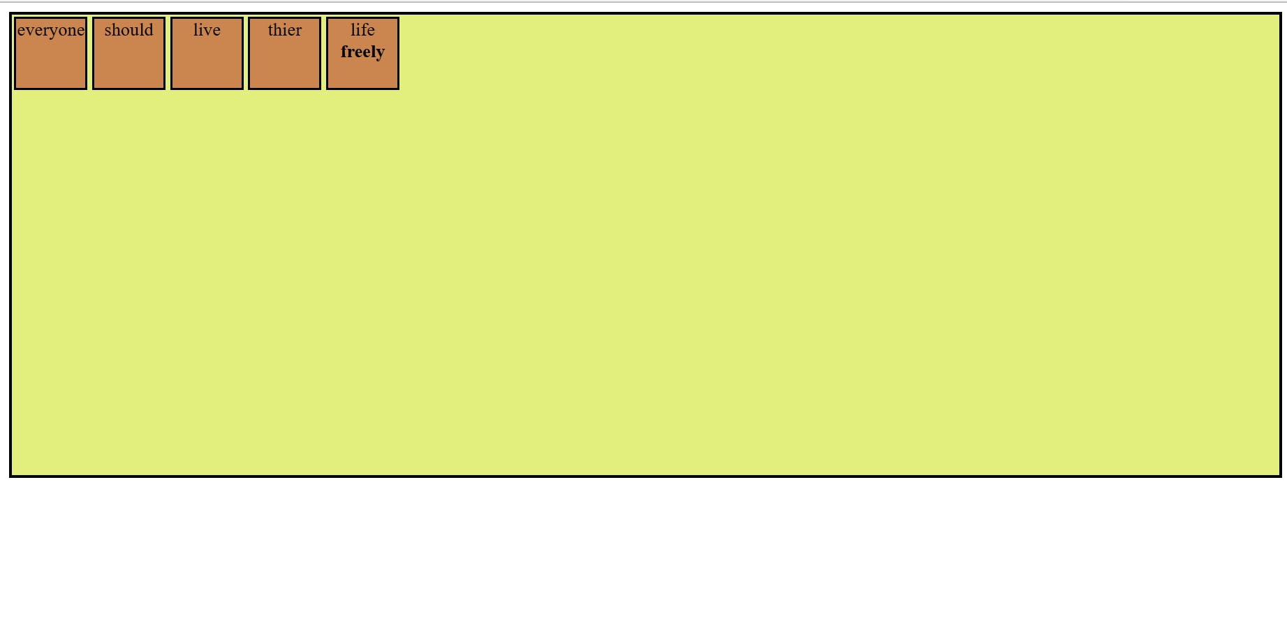
.container{
            display: flex;
            flex-direction:row;
            background-color: rgb(227, 239, 124);
            width: 1100px;
            height: 400px;
            border:3px solid black

        }
example-
4. Flex-wrap-
An issue that arises when you have a fixed width or height in your layout is that eventually, your flexbox children will overflow their container, breaking the layout. To solve this problem we will use flex-wrap so you can change that and allow the items to wrap as needed with this property.
(a)nowrap (default): all flex items will be on one line.
(b)wrap: flex items will wrap onto multiple lines, from top to bottom.
(c)wrap-reverse: flex items will wrap onto multiple lines from bottom to top.
Syntax-
 .container{
            display: flex;
            flex-wrap: nowrap | wrap | wrap-reverse;
        }
5. Justify-content-
justify-content controls where the flex items sit on the main axis.
flex-start(default)-all the items sit at the start of the main axis.
flex-end-all the items sit at the end of the main axis.
center-all the items sit at the center of the main axis.
space-around- It distributes all the items evenly along the main axis with space left at either end.
space-between-It distributes all the items evenly along the main axis, it doesn't leave any space at either end.
Syntax-
.container{
            display: flex;
            justify-content: flex-start | flex-end | center | space-around | space-between ;
        }
6. align-items:
align-items controls where the flex items sit on the cross-axis (perpendicular to the main axis). Stretch(default) in align-items.
7. align-content:
This property only takes effect on multi-line flexible containers. This aligns a flex container’s lines within when there is extra space in the cross-axis.
normal as default in align-content. other are flex-start,flex-end, center, space-between, space-around, space-evenly, and stretch.
8. Gap:
Gap property divided into two parts
(i)row-gap
(ii) column-gap
Gap property controls the space between flex items. It applies that spacing only between items.
9. Order:
Order feature for changing the layout order of flex items without affecting the source order.
10. align-self:
This allows the default alignment to be overridden for individual flex items.