


1. Selector-
I already cover CSS selectors in my previous blog. you can go to this link and read about selectors with examples.
link- (https://sandeepvaishnav.hashnode.dev/css-selectors)
2.pseudo-class (hover)-
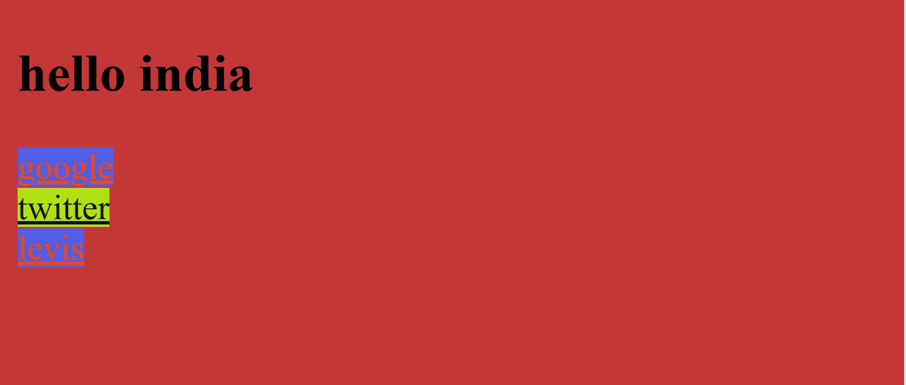
The pseudo-class hover matches when the user interacts with an element with a pointing device, but does not necessarily activate it. It is generally triggered when the user hovers over an element with the cursor (mouse pointer).
Syntax-
a:hover{
            background-color: rgb(175, 224, 16);
            color: rgb(17, 17, 17);
        }
example-
<!DOCTYPE html>
<html lang="en">
<head>
    <meta charset="UTF-8">
    <meta http-equiv="X-UA-Compatible" content="IE=edge">
    <meta name="viewport" content="width=device-width, initial-scale=1.0">
    <title>css</title>
    <style>


        *{
            background-color: rgb(196, 55, 55);
        }
        a:visited{
            background-color: rgb(82, 94, 230);
            color: orangered;
        }
        a:link{
            background-color: rgb(65, 185, 5);
            color: red;
        }
        a:hover{
            background-color: rgb(175, 224, 16);
            color: rgb(17, 17, 17);
        }

    </style>
</head>
<body>
    <h2> hello india</h2>
    <a href="http://google.com" target="_blank">google</a><br>
    <a href="http://twitter.com" target="_blank">twitter</a><br>
    <a href="http://levis.com" target="_blank">levis</a>
</body>
</html>
Output-
3.pseudo-class(focus)-
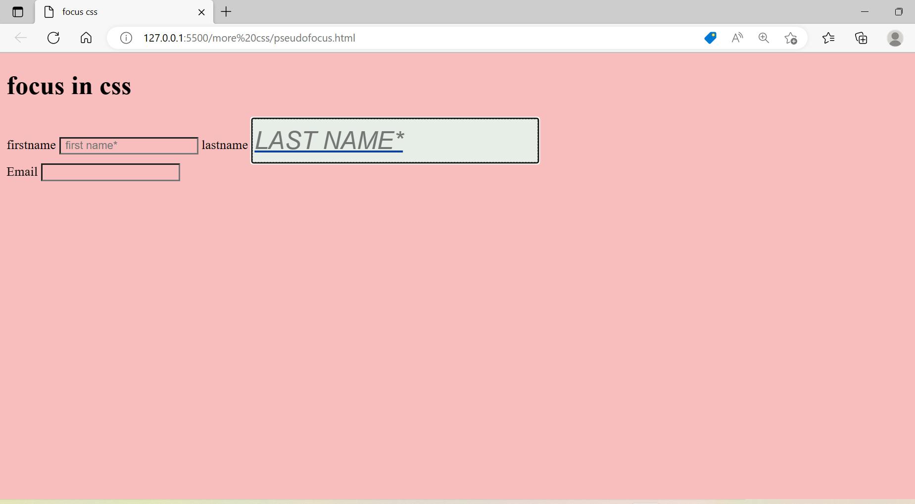
Focus simply means that something is going to get pointed out. Focus represents an element that has received focus. It is generally triggered when the user clicks or taps on an element.
Syntax-
input:focus[type=text]{
            background-color: rgb(232, 238, 232);
            color: rgb(13, 69, 154);
            font-size:30px;
            font-style: italic;
            text-transform:uppercase;
            block-size: 50px;
            text-decoration:underline;
            border-style:dotted;
         }
example-
<!DOCTYPE html>
<html lang="en">
<head>
    <meta charset="UTF-8">
    <meta http-equiv="X-UA-Compatible" content="IE=edge">
    <meta name="viewport" content="width=device-width, initial-scale=1.0">
    <title>focus css</title>
    <style>
        *{
            background-color: rgb(249, 190, 190);
        }
      input:focus[type=text]{
            background-color: rgb(232, 238, 232);
            color: rgb(13, 69, 154);
            font-size:30px;
            font-style: italic;
            text-transform:uppercase;
            block-size: 50px;
            text-decoration:underline;
            border-style:dotted;
         }
         </style>
</head>
<body>
    <h1>focus in css</h1>
    <label for="fname">firstname</label>
    <input class="bg" type="text" name="" id="fname" placeholder=" first name*" required>
    <label for="lname">lastname</label>
    <input type="text" name="" id="lname" placeholder="last name*" required><br>
    <label for="eme">Email</label>
    <input type="email" name="email" id="eme">

</body>
</html>
Output-
4. Margin-
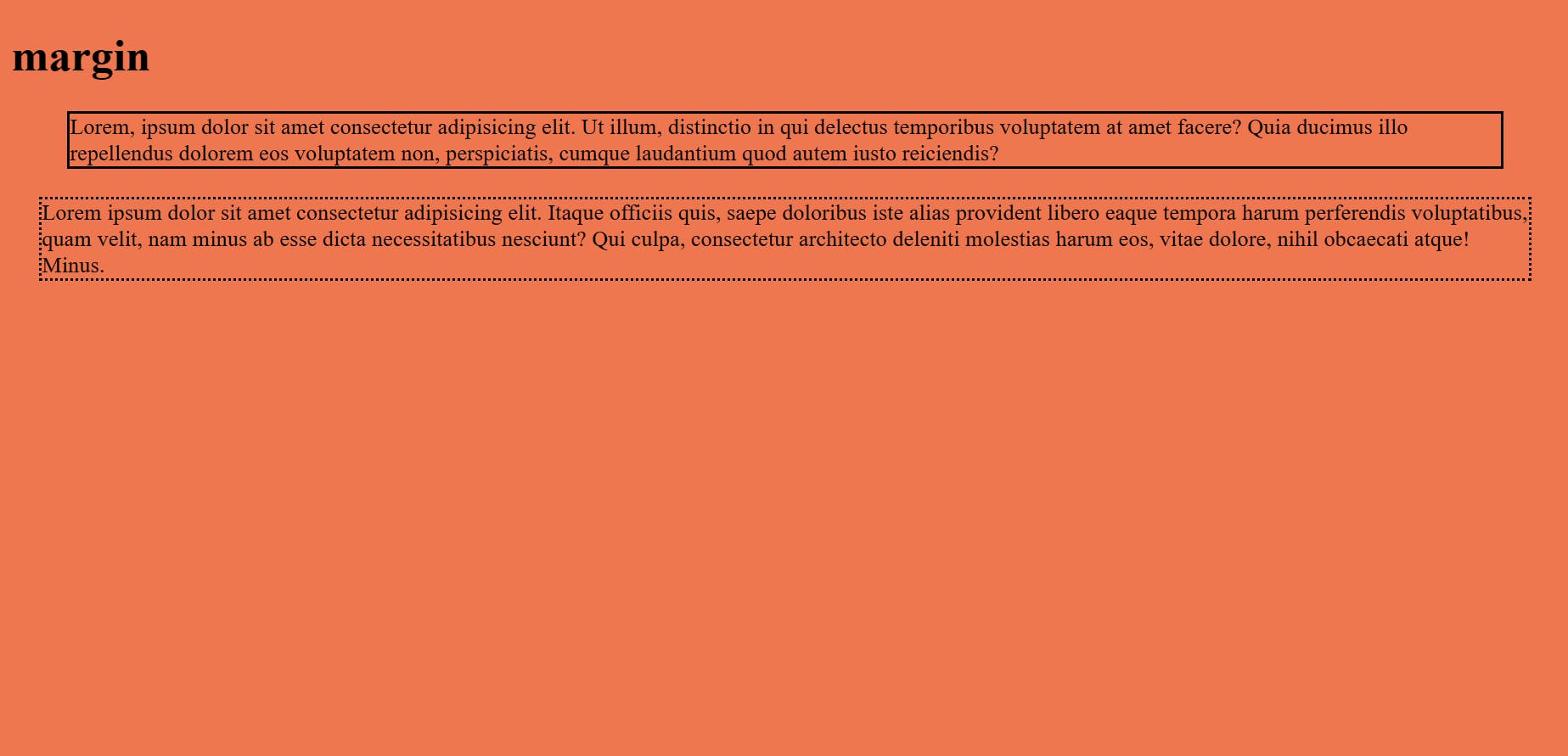
Margin is from outside and margin property set the margin area on four sides of an element as a default. we can change the margin according to your requirement.
Syntax-
div{
            border-style: solid;
            margin: 20px 40px 20px 40px;
           }
example-
<!DOCTYPE html>
<html lang="en">
<head>
    <meta charset="UTF-8">
    <meta http-equiv="X-UA-Compatible" content="IE=edge">
    <meta name="viewport" content="width=device-width, initial-scale=1.0">
    <title>
        margin
    </title>
    <style>
        div{
            border-style: solid;
            margin: 20px 40px 20px 40px;
           }

        p{
            border-style: dotted;
            margin:15px 20px;
         }
    </style>
</head>
<body>
    <h1> margin</h1>
    <!-- margin is from outside  -->
    <div>
        Lorem, ipsum dolor sit amet consectetur adipisicing elit. Ut illum, distinctio in qui delectus temporibus voluptatem at amet facere? Quia ducimus illo repellendus dolorem eos voluptatem non, perspiciatis, cumque laudantium quod autem iusto reiciendis?
    </div>
    <p>Lorem ipsum dolor sit amet consectetur adipisicing elit. Itaque officiis quis, saepe doloribus iste alias provident libero eaque tempora harum perferendis voluptatibus, quam velit, nam minus ab esse dicta necessitatibus nesciunt? Qui culpa, consectetur architecto deleniti molestias harum eos, vitae dolore, nihil obcaecati atque! Minus.</p>
</body>
</html>
Output-
5. Padding-
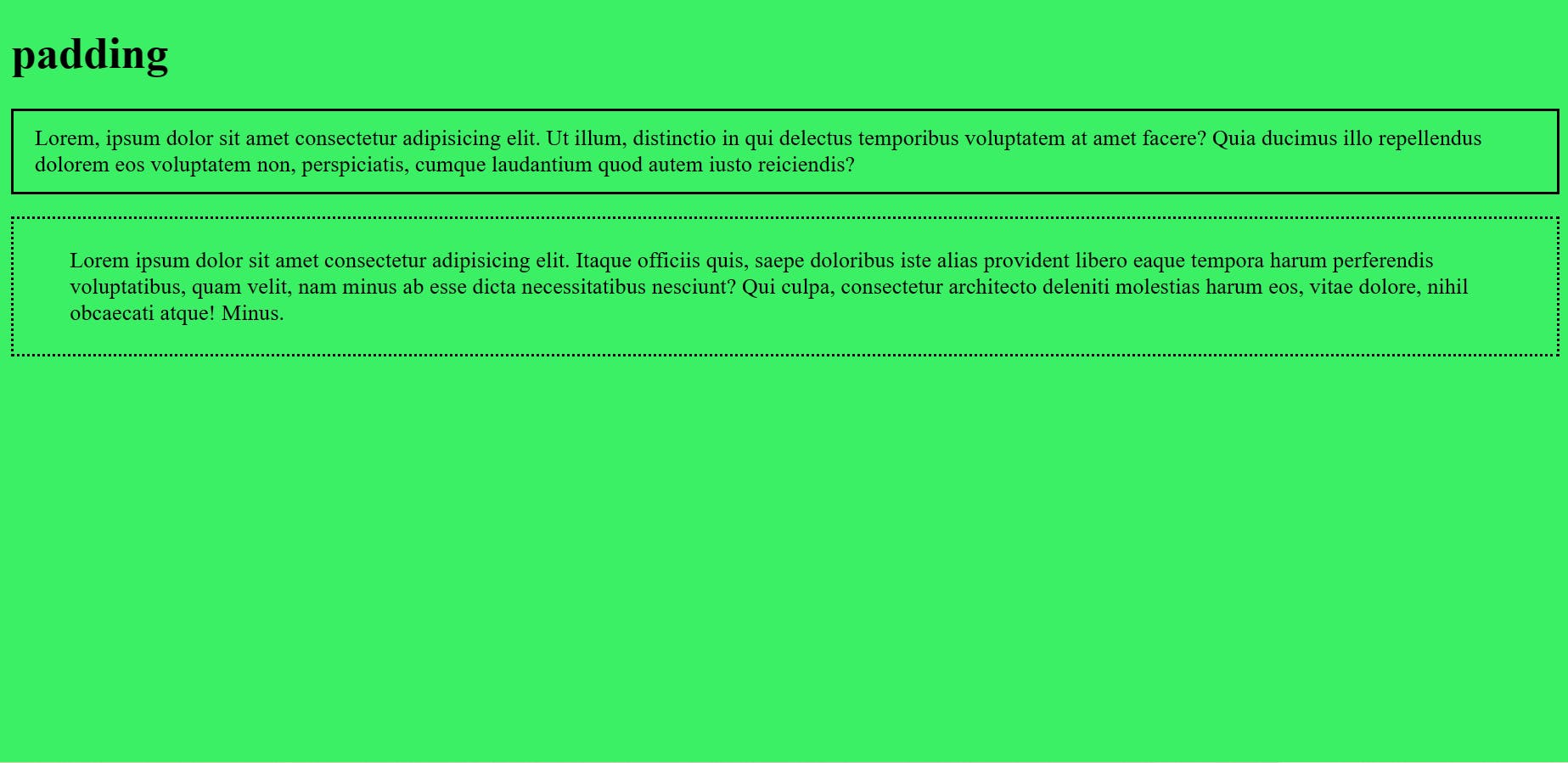
Padding is from the inside and the padding property set the padding area on four sides of an element as a default. we can change the padding according to your requirement.
Syntax-
div{
            border-style: solid;
            padding: 10px 15px 10px 15px;
        }
example-
<!DOCTYPE html>
<html lang="en">
<head>
    <meta charset="UTF-8">
    <meta http-equiv="X-UA-Compatible" content="IE=edge">
    <meta name="viewport" content="width=device-width, initial-scale=1.0">
    <title>
        padding
    </title>
    <style>
        div{
            border-style: solid;
            padding: 10px 15px 10px 15px;
        }
        p{
            border-style: dotted;
            padding: 20px 40px;
        }
        </style>

        </head>
        <body>
            <h1> padding </h1>
            <!-- padding is from inside -->
            <div>
                Lorem, ipsum dolor sit amet consectetur adipisicing elit. Ut illum, distinctio in qui delectus temporibus voluptatem at amet facere? Quia ducimus illo repellendus dolorem eos voluptatem non, perspiciatis, cumque laudantium quod autem iusto reiciendis?
            </div>
            <p>Lorem ipsum dolor sit amet consectetur adipisicing elit. Itaque officiis quis, saepe doloribus iste alias provident libero eaque tempora harum perferendis voluptatibus, quam velit, nam minus ab esse dicta necessitatibus nesciunt? Qui culpa, consectetur architecto deleniti molestias harum eos, vitae dolore, nihil obcaecati atque! Minus.</p>
        </body>
        </html>
Output-
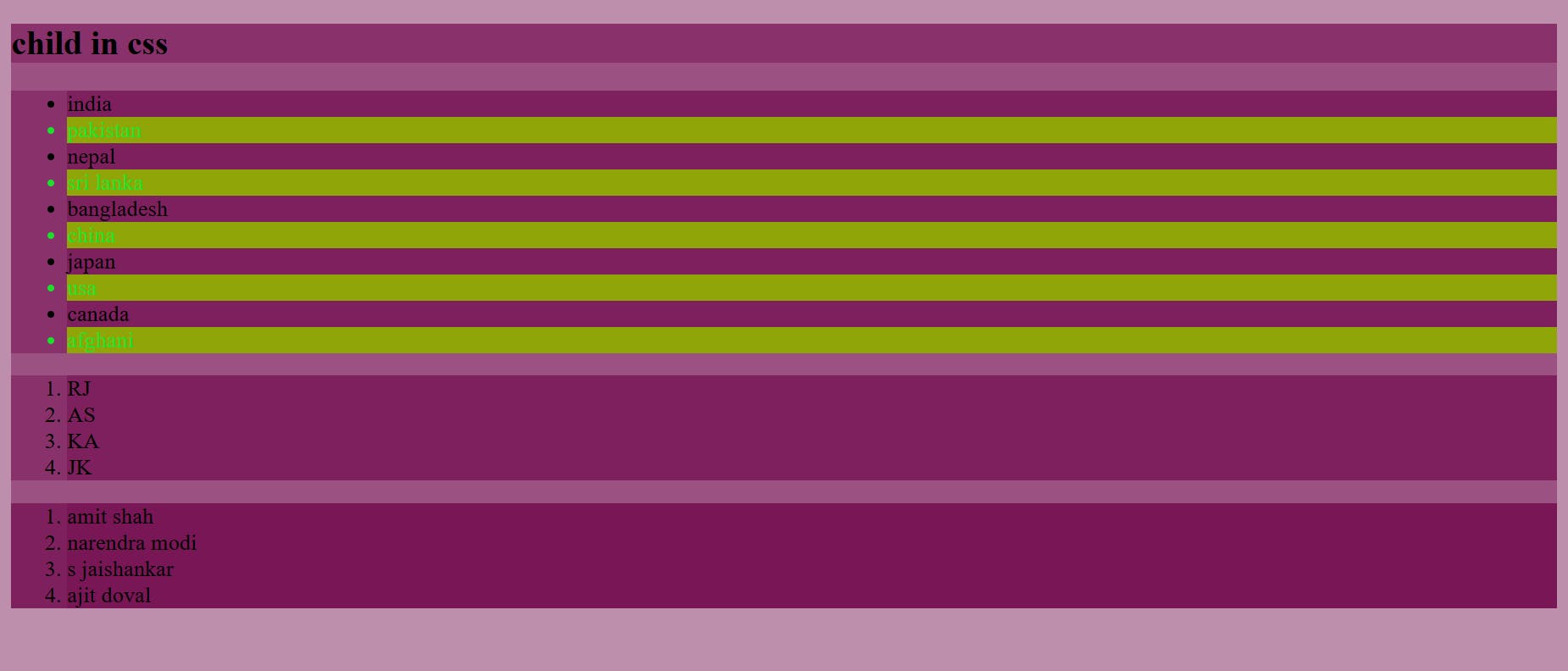
6. Child-
(a)nth-child-
nth-child matches elements based on their position among a group of siblings like even, odd,(2n-1) where n is 1,2,3...so on.
Syntax-
ul>li:nth-child(even){
            color: rgb(27, 224, 43);
            background-color: rgb(144, 165, 7);
        }
example-
<!DOCTYPE html>
<html lang="en">
<head>
    <meta charset="UTF-8">
    <meta http-equiv="X-UA-Compatible" content="IE=edge">
    <meta name="viewport" content="width=device-width, initial-scale=1.0">
    <title>child in css</title>
    <style>
        *{
            background-color: rgba(114, 10, 78, 0.459);
        }
        ul>li:nth-child(even){
            color: rgb(27, 224, 43);
            background-color: rgb(144, 165, 7);
        }
      </style>
</head>
<body>
    <h2>child in css</h2>
    <ul>
        <li>india</li>
        <li>pakistan</li>
        <li>nepal</li>
        <li>sri lanka</li>
        <li>bangladesh</li>
        <li>china</li>
        <li>japan</li>
        <li>usa</li>
        <li>canada</li>
        <li>afghani</li>
    </ul>
    <span>
        <ol>
            <li>RJ</li>
            <li>AS</li>
            <li>KA</li>
            <li>JK</li>
        </ol>
    </span>
    <div>
        <ol>
            <li>amit shah</li>
            <li>narendra modi</li>
            <li>s jaishankar</li>
            <li>ajit doval</li>
        </ol>
    </div>

</body>
</html>
Output-
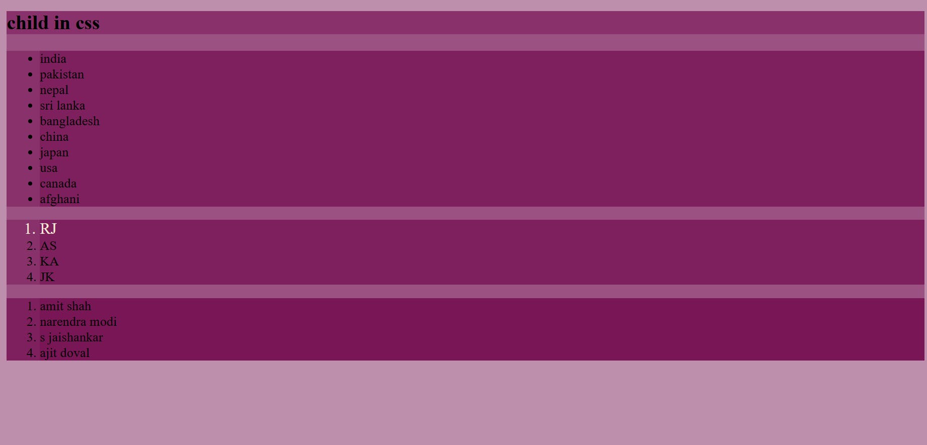
(b)First child-
The first child represents the first element among a group of sibling elements.
Syntax-
span>ol>li:first-child{
            font-size: larger;
            color: antiquewhite;
        }
example-
<!DOCTYPE html>
<html lang="en">
<head>
    <meta charset="UTF-8">
    <meta http-equiv="X-UA-Compatible" content="IE=edge">
    <meta name="viewport" content="width=device-width, initial-scale=1.0">
    <title>child in css</title>
    <style>
        *{
            background-color: rgba(114, 10, 78, 0.459);
        }

        span>ol>li:first-child{
            font-size: larger;
            color: antiquewhite;
        }

    </style>
</head>
<body>
    <h2>child in css</h2>
    <ul>
        <li>india</li>
        <li>pakistan</li>
        <li>nepal</li>
        <li>sri lanka</li>
        <li>bangladesh</li>
        <li>china</li>
        <li>japan</li>
        <li>usa</li>
        <li>canada</li>
        <li>afghani</li>
    </ul>
    <span>
        <ol>
            <li>RJ</li>
            <li>AS</li>
            <li>KA</li>
            <li>JK</li>
        </ol>
    </span>
    <div>
        <ol>
            <li>amit shah</li>
            <li>narendra modi</li>
            <li>s jaishankar</li>
            <li>ajit doval</li>
        </ol>
    </div>

</body>
</html>
Output-
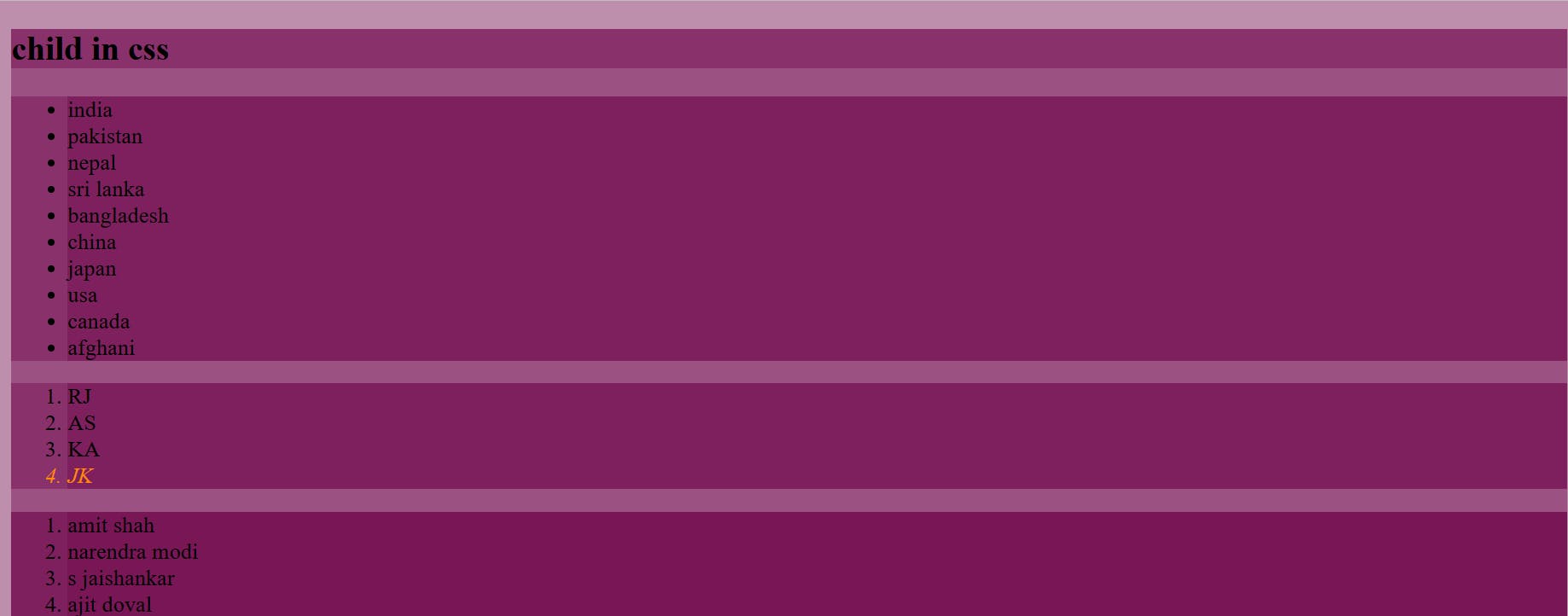
(c)Last child-
The last child represents the last element among a group of sibling elements.
Syntax-
span>ol>li:last-child{
            font-style: oblique;
            color: darkorange;
        }
example-
<!DOCTYPE html>
<html lang="en">
<head>
    <meta charset="UTF-8">
    <meta http-equiv="X-UA-Compatible" content="IE=edge">
    <meta name="viewport" content="width=device-width, initial-scale=1.0">
    <title>child in css</title>
    <style>
        *{
            background-color: rgba(114, 10, 78, 0.459);
        }

        span>ol>li:last-child{
            font-style: oblique;
            color: darkorange;
        }

    </style>
</head>
<body>
    <h2>child in css</h2>
    <ul>
        <li>india</li>
        <li>pakistan</li>
        <li>nepal</li>
        <li>sri lanka</li>
        <li>bangladesh</li>
        <li>china</li>
        <li>japan</li>
        <li>usa</li>
        <li>canada</li>
        <li>afghani</li>
    </ul>
    <span>
        <ol>
            <li>RJ</li>
            <li>AS</li>
            <li>KA</li>
            <li>JK</li>
        </ol>
    </span>
    <div>
        <ol>
            <li>amit shah</li>
            <li>narendra modi</li>
            <li>s jaishankar</li>
            <li>ajit doval</li>
        </ol>
    </div>

</body>
</html>
Output-
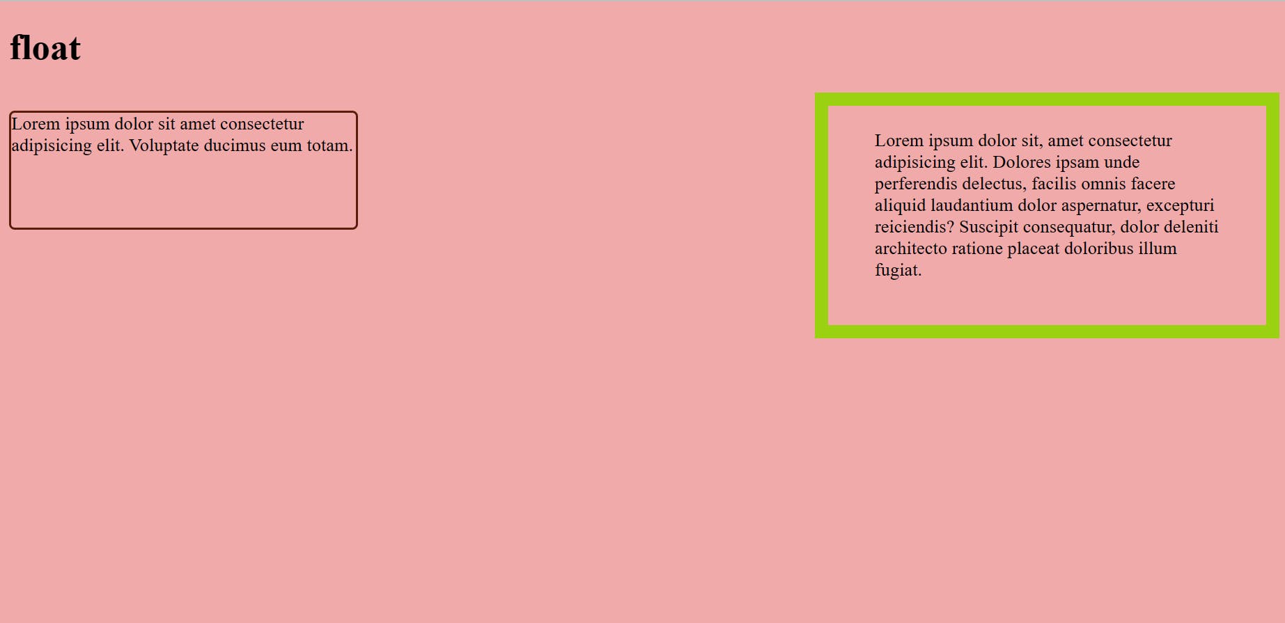
7. Float-
Float CSS property places an element on the left or right side of its container, allowing text and inline elements to wrap around it.
Syntax-
 p{
            border-radius: 5px;
            border-style: solid;
            border-color: rgb(88, 30, 11);
            width: 300px;
            height: 100px;
            float: left;
        }
example-
<!DOCTYPE html>
<html lang="en">
<head>
    <meta charset="UTF-8">
    <meta http-equiv="X-UA-Compatible" content="IE=edge">
    <meta name="viewport" content="width=device-width, initial-scale=1.0">
    <title>float</title>
    <style>
        *{
            background-color: rgb(241, 170, 170);
        }
        p{
            border-radius: 5px;
            border-style: solid;
            border-color: rgb(88, 30, 11);
            width: 300px;
            height: 100px;
            float: left;
        }
        div{
            border: 12px solid #9ad110;
            width: 300px;
            height: 150px;
            float: right;
            padding: 20px 40px;

        }

    </style>

</head>
<body>
    <h1>
        float
    </h1>
    <p>
        Lorem ipsum dolor sit amet consectetur adipisicing elit. Voluptate ducimus eum totam.
    </p>
    <div>
        Lorem ipsum dolor sit, amet consectetur adipisicing elit. Dolores ipsam unde perferendis delectus, facilis omnis facere aliquid laudantium dolor aspernatur, excepturi reiciendis? Suscipit consequatur, dolor deleniti architecto ratione placeat doloribus illum fugiat.
    </div>
</body>
</html>
Output-
8. Visited, linked (pseudo class)-
Visited- This class applies once the link has been visited by the user and applies to the anchor element that has an href attribute.
link- This link will get only applied till the time user is not visiting.